Project #6 Data Portrait - Step by Step
Design Process
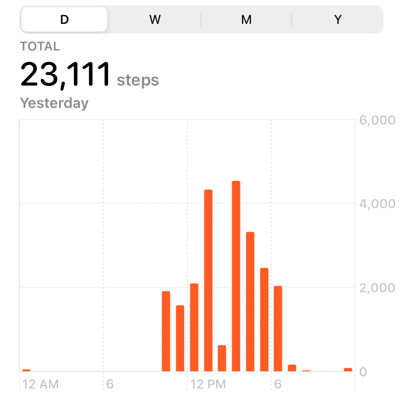
The Health app on my phone records the number of steps taken each day, and this data can be quickly fetched and translated into visualizations. Also by analyzing the data of steps, we can see the main activity time of every day. By overlaying the data for different dates, we can also see the average activity time preferences.

I put the data by hours into arrays of each day. By calling the data from arrays, the length of the line represents the number of steps in this period. The animation of the background is just to make the picture more dynamic, but the diameter of each circle is also from the arrays.
Reflection
With the daily step count, I can easily see which days I am stuck at home for Zoom meetings and which days I go to school for classes.
At the same time, I can see that I wake up and go to bed at a relatively regular time every day. This reminds me of my week 3 reading feedback, looks like I'm in school mode lol.
However, because of the pixel limitation, the relationship between some data is not better represented. Also too many overlapping parts make the pattern difficult to distinguish.
These are the parts that are lost in this visualization.